
NASA Solar System Exploration
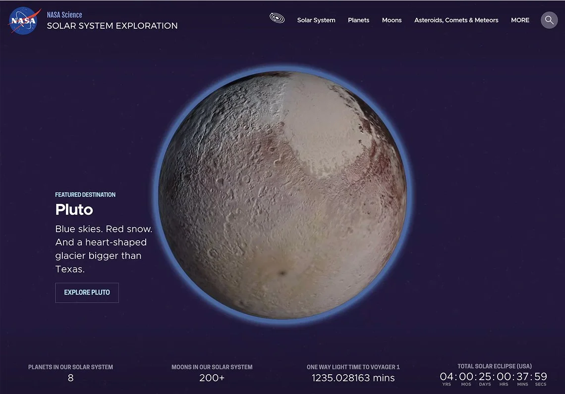
A complete re-architecture of NASA’s Solar System experience into a dynamic, explorable encyclopedia for millions of learners.
ROLE
Design lead (sole designer): information architecture, content strategy, UI and visual design
SCOPE
Stakeholder discovery · Analytics review · User interviews and research report · Content audit · Information architecture · Tagging strategy · Color and design system · UI for WebGL interactives · Engineering collaboration
PROBLEM
Decades of NASA solar system content with no clear way to explore.
NASA’s Solar System Exploration website (SSE) had no shortage of incredible photos, facts and stories. The problem was finding them. The site was flat: a list of destinations with no relationship to one another, each with a sprawling array of subpages, and content depth that varied from page to page. Dark imagery on black backgrounds made the whole experience heavy. Our main task was to make all of it easy and fun to explore.
I interviewed stakeholders, teachers, students and a NASA appointed “Solar System Ambassador.” Kids went straight to images and video, and everyone wanted facts fast. That set the requirements: easy summaries with deeper content close by, stronger visuals, color alongside real photos, and a site that felt alive.
KEY DECISION 1/3
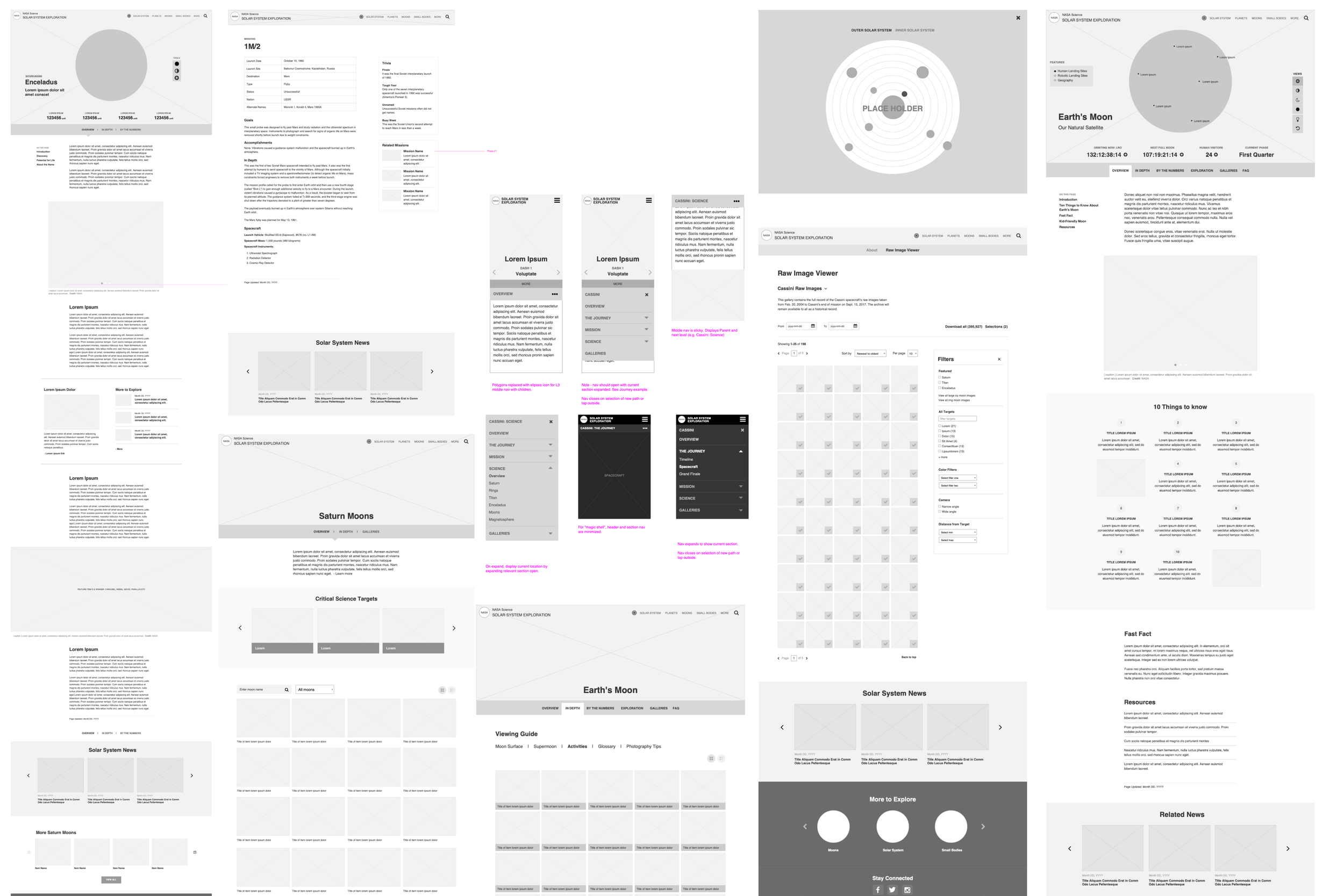
An entity-based approach made it possible for users to understand the structure of our solar system by opening the nav alone.
A section for all planets, a section for all moons, each with an overview explaining what sets each one apart. Opening the Planets nav showed main planets vs. dwarf planets. Opening Moons showed which planets had moons and how many. Every destination could stand on its own and still sit clearly inside the whole.
It wasn’t all clean. The whole site was the solar system, yet one section was named “Solar System.” But it gave me a home for bigger topics like the Sun, eclipses and exoplanets. I also tucked some leftover content into a “more” section. While I don’t like hiding content, this approach held up fine in testing and let the main entities shine.
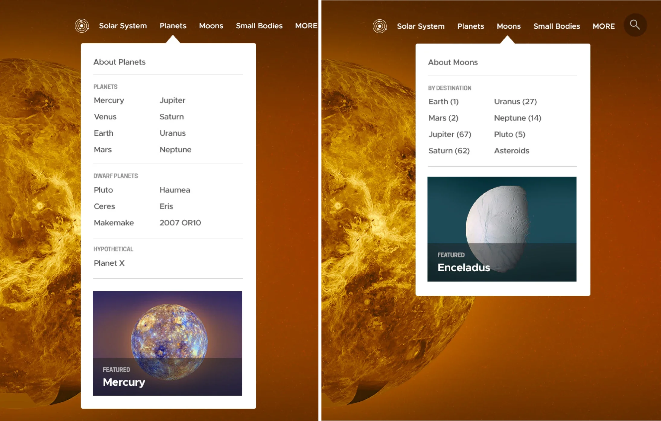
The nav was more than just a list of links, it alone provided key information about classification, order and relationships.
KEY DECISION 2/3
A custom palette for each major planet infused color without interfering with real imagery.
NASA leadership gave us two mandates that pulled against each other: use real imagery, and avoid an all-black website. Since space photography is mostly black, gray and muted, we put the color in the interface instead, with a palette for each major planet starting with a hero featuring a colorful background.
Colored hero backgrounds bent leadership’s rule, but they were approved because they launched each planet’s color system and the rest of the site stayed true to real photos. The minor bodies never got palettes, though their pages were small enough that other visual cues kept them tied to their parent planet.
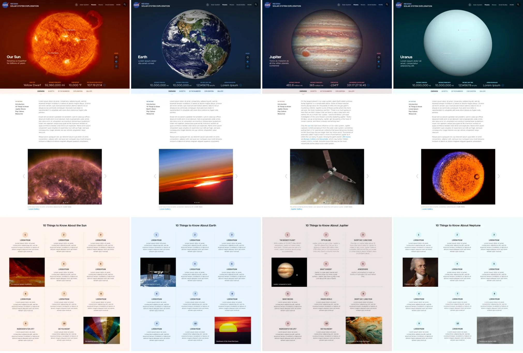
Colors brought warmth. Plus, you always knew when you'd left Earth and were hanging out on Jupiter.
KEY DECISION 3/3
Dashboards and smart tagging kept the site alive with a tiny content team.
There were only a few writer/producers on the NASA side, sometimes just one. Dashboards on major destinations showed light-time, distance from the Sun and mission countdowns, all updating on their own. I also architected a tagging system with relationships built in, so a story tagged "Jupiter" showed up on Jupiter and its moons while Europa could still have news of its own. Mapping that was a real struggle, but one story from a producer could refresh a dozen pages.
Each major planet and some key moons had a dashboard with live elements. Shown here is one of the planetary interactives with select hotspots and rotation.
OUTCOME
Traffic nearly tripled, and people found content that had been buried for years.
We relaunched in January 2018. Traffic dipped while search engines caught up, and then the entity approach took off. The site became one of NASA's top five web destinations and held that position until it merged with science.nasa.gov.
A few days after launch, a NASA scientist flagged a factual error on one of the pages, and the producer I worked with was thrilled because that error had been on the old site for years.
It was gratifying to see our users more easily find the content they clearly were searching for, and discover the hidden gems of the great content that might have been overlooked in the dark recesses of the older versions of the site.
Phil Davis, Senior Web Publisher, JPL/NASA
SSE's architecture became a foundation for science.nasa.gov.
AND NOW, THIS
In 2020, NASA began merging its outreach sites into science.nasa.gov, and its architects carried SSE's entity-based approach well beyond the solar system. I helped bring the templated navs over where they fit. Migrations usually cost search traffic, but most planets matched or beat their old SSE numbers.