
CASE STUDY — A DATA VISUALIZATION PLATFORM
NASA Sea Level Rise Data Tools
Transforming complex climate projections into intuitive, decision-ready tools used by practitioners, policymakers, and the public worldwide.
My Role
Experience Architect, UX Lead, IA + Product Design (Sole Designer)
Launched in 2021, the IPCC Sea Level Projection Tool quickly exceeded international expectations and continues to draw strong global traffic today.
The Challenge
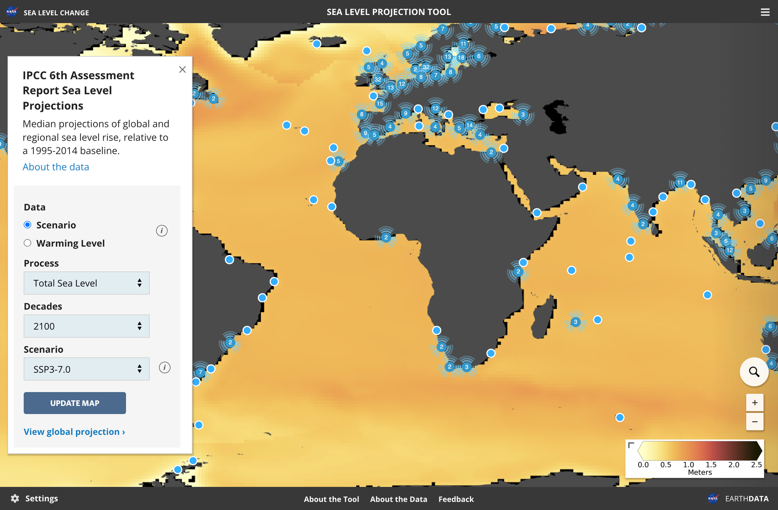
Sea level science is complex by nature: multiple datasets, regional variability, uncertainty ranges, and future scenarios. NASA needed tools that could responsibly communicate this complexity to wide set of users without flattening nuance or overwhelming people.
This wasn’t about polishing charts. It was about designing a format that made complex climate data understandable, navigable, and meaningful for journalists, policymakers, practitioners, and the public alike.
The Opportunity
The project demanded someone who could:
Balance scientific nuance with accessibility
Design for multiple expertise levels
Create scalable patterns for future datasets
Partner directly with climate scientists
Reduce cognitive load without oversimplifying
This was a perfect fit for my strengths: making complex quantitative information feel intuitive, navigable, and meaningful.
Research & Key Insights
I synthesized information from discovery meetings as well as informal usability reviews with key practitioners.
Key themes emerged:
Practitioners wanted a clear summary first, then paths to deeper detail
Non-experts needed a way to understand complex visualizations
Users wanted a clear takeaway first, then depth
Trust increased when summaries explained “what this means”
Different users needed different levels of detail, not different tools
These insights shaped the navigation model and content hierarchy.
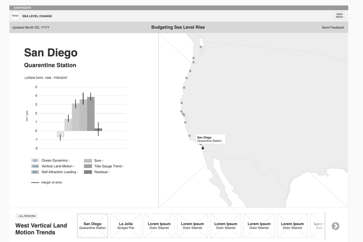
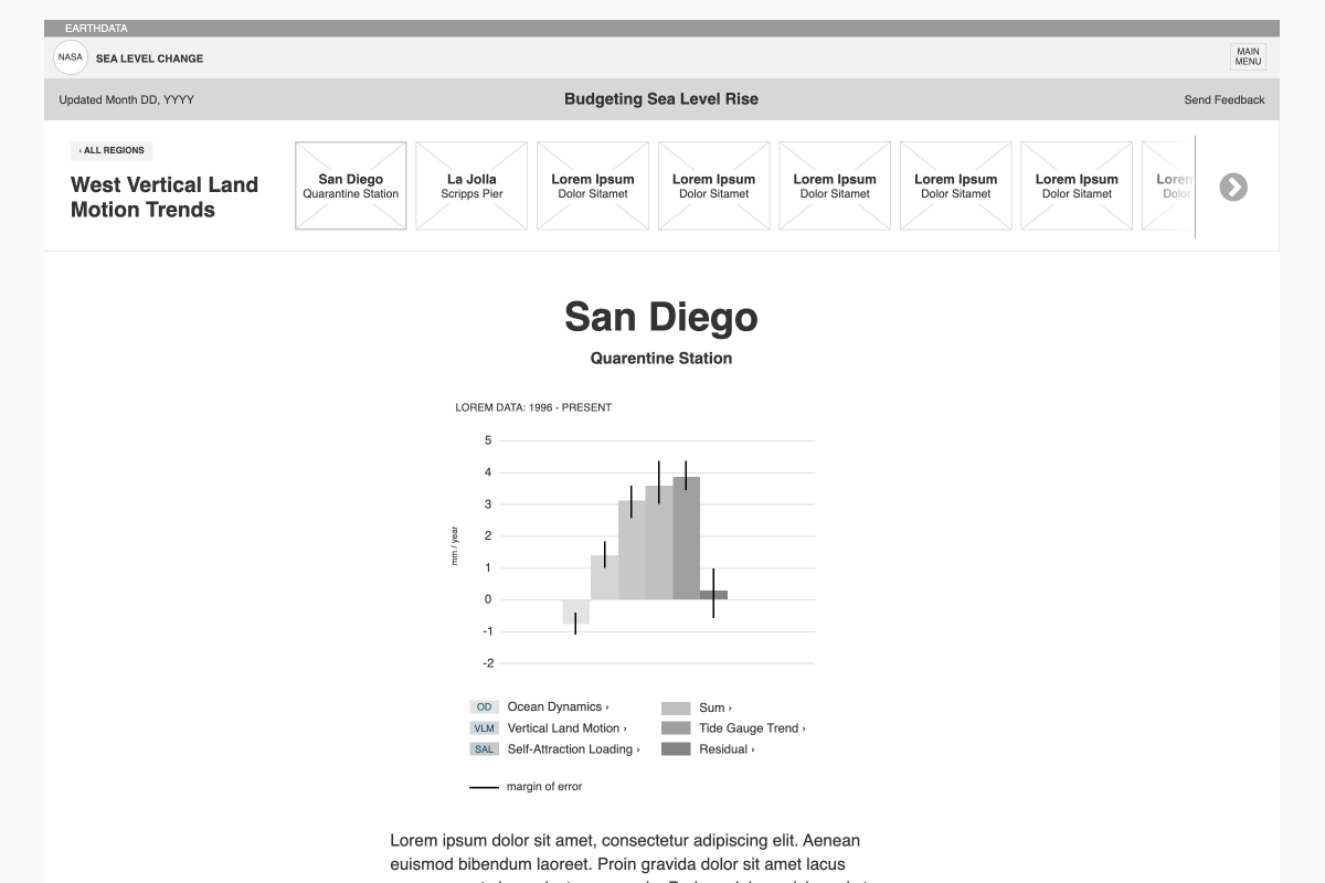
Early IPCC tool wireframes explored two detail patterns: map slide-outs versus dedicated detail pages. The latter won out, enabling mobile-first, vertical exploration, easier sharing, and a scalable framework.
Detail views expanded into multi-page experiences with summary statements and expandable components pulling from the parent site. This wireframe reflects the third tool in the series.
The Solution
A multi-layered, scalable data exploration system used across several NASA sea level tools.
Key elements:
-
Summary on map click → dedicated detail page → additional depth as needed.
This became the backbone of the entire platform. -
A structure that allowed new datasets, scenarios, and methodologies to plug in without redesign.
-
Clear summaries, contextual text, visual flags for confidence levels, and consistent layout frameworks.
-
Patterns for maps, charts, sliders, region selectors, scenario toggles, and interpretive text.
-
Collaborated with NASA’s Senior Sea Level Scientist to ensure UX choices reflected scientific nuance responsibly.
I avoided overlay-heavy interactions in favor of a structure that surfaced summaries from the map and flowed naturally into rich detail pages, supporting deeper context and long-term scalability.
Because users had varying levels of device access, all tools were fully responsive, delivering nearly all features across viewports.
As complexity grew, detail pages added summaries, collapsible key points, and progressive disclosure. I continually refined the UI to keep content digestible while enabling deeper learning.
New tools introduced enhancements like jump links, replayable animated charts, and expandable sections to improve clarity without overwhelming users.
Collaboration
I partnered closely with:
NASA’s Senior Sea Level Scientist
Data engineers and developers
Communications and outreach teams
Internal partners coordinating releases
Impact
Ongoing collaboration and recurring budgets
Broad adoption across media, policy, and resilience planning
Recognition for setting a new standard in communicating sea level science
Tools cited by NASA partner as internationally unmatched in effectiveness
What’s new here is a tool that we are providing to the community, to distribute the latest climate knowledge produced by the IPCC and NASA scientists in an accessible and user-friendly way while maintaining scientific integrity.
Quote from Nadya Vinogradova Shiffer, program scientist and manager at NASA, who directs NASA’s Sea Level Change science team in the press release for the IPCC tool.
Links