
Case Study — A REALLY BIG WEBSITE
NASA Solar System Website
A complete re-architecture of NASA’s Solar System experience into a dynamic, explorable encyclopedia for millions of learners.
My Role
Experience Architect, UX Lead, IA + Product Design (Sole Designer)
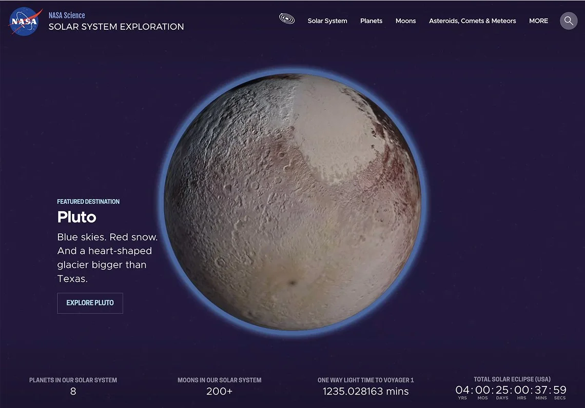
The home page encouraged exploration, featuring destinations through short, compelling facts. Dashboards here and on key pages surfaced mission countdowns and real-time data like light-time and distance from the Sun.
The Challenge
NASA’s Solar System site held extraordinary science and educational content but users couldn’t find it. Navigation was rigid, the information architecture had collapsed under years of growth, and contributors struggled to expand the site meaningfully.
This wasn’t a redesign. It required rebuilding the entire experience model.
The Opportunity
This project needed someone who could:
Translate scientific depth for broad audiences
Architect a system flexible enough for future missions
Reduce cognitive load without oversimplifying
Collaborate across scientists, educators, engineers, and stakeholders
This is where I do my best work: complex systems that need clarity and humanity.
Research & Key Insights
Through interviews and usability reviews with educators, students, and space enthusiasts, several patterns emerged:
Users wanted to explore, not search
Educators needed predictable, trustworthy structures
Casual users needed multiple entry points
The existing IA didn’t match how people learn about space
These insights drove the new architecture, navigation, and content hierarchy.
A content audit drove sitemaps and wireframes, quickly converging on an entity-based IA and repeatable “destination” pattern that tested strongly and helped users feel oriented.
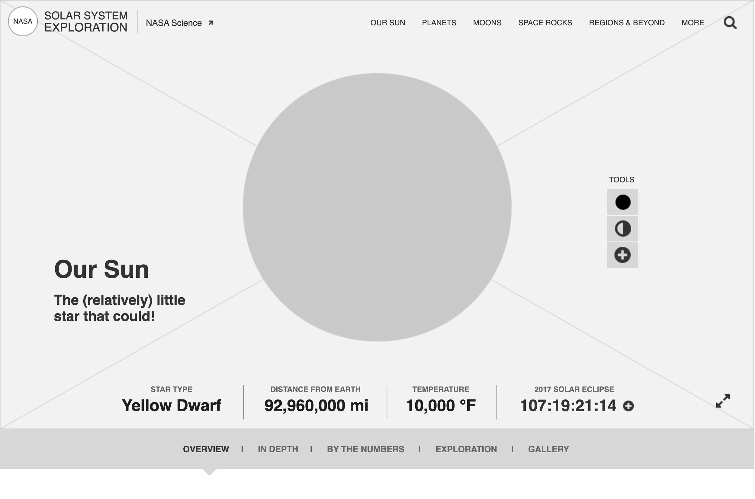
An early wireframe for the Sun overview page, introducing the “quippy” destination tagline and repeatable section structure used across all destinations.
The Solution
-
Mapping planets → moons →comets, meteors & asteroids → missions → people (powered dynamic relationships across pages).
-
Future-proof structure supporting discoveries, news, missions and scientific events.
-
UI components, WebGL interactive patterns, galleries, fact modules, data views.
-
Skimmable facts, related content, visual clusters, guided exploration flows.
-
A planetary color system to replace the harsh black palette and improve approachability.
A living, interconnected encyclopedia designed for exploration.
Key elements:
Several planets and a few special moons (hello Earth’s Moon) featured interactives that gave users the ability to explore surfaces, cores and datamaps.
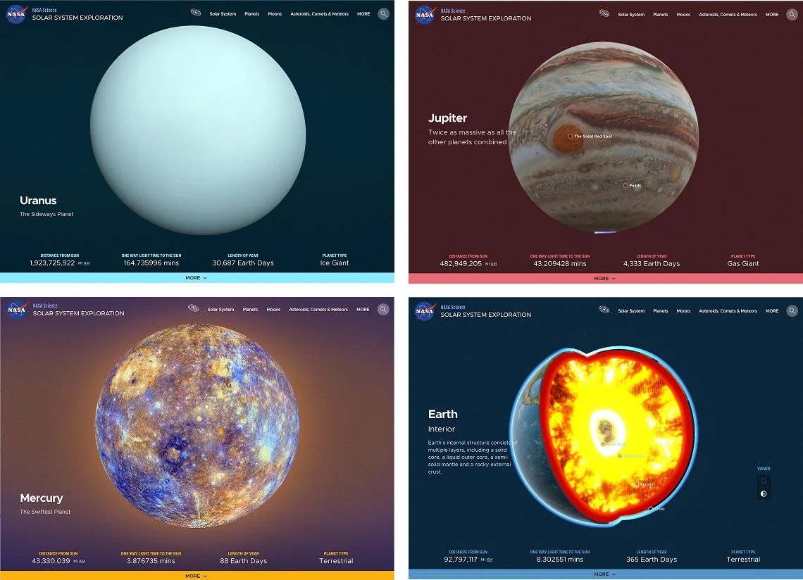
Color-coded destinations replaced the all-black palette, balancing real imagery with a warmer, more approachable interface.
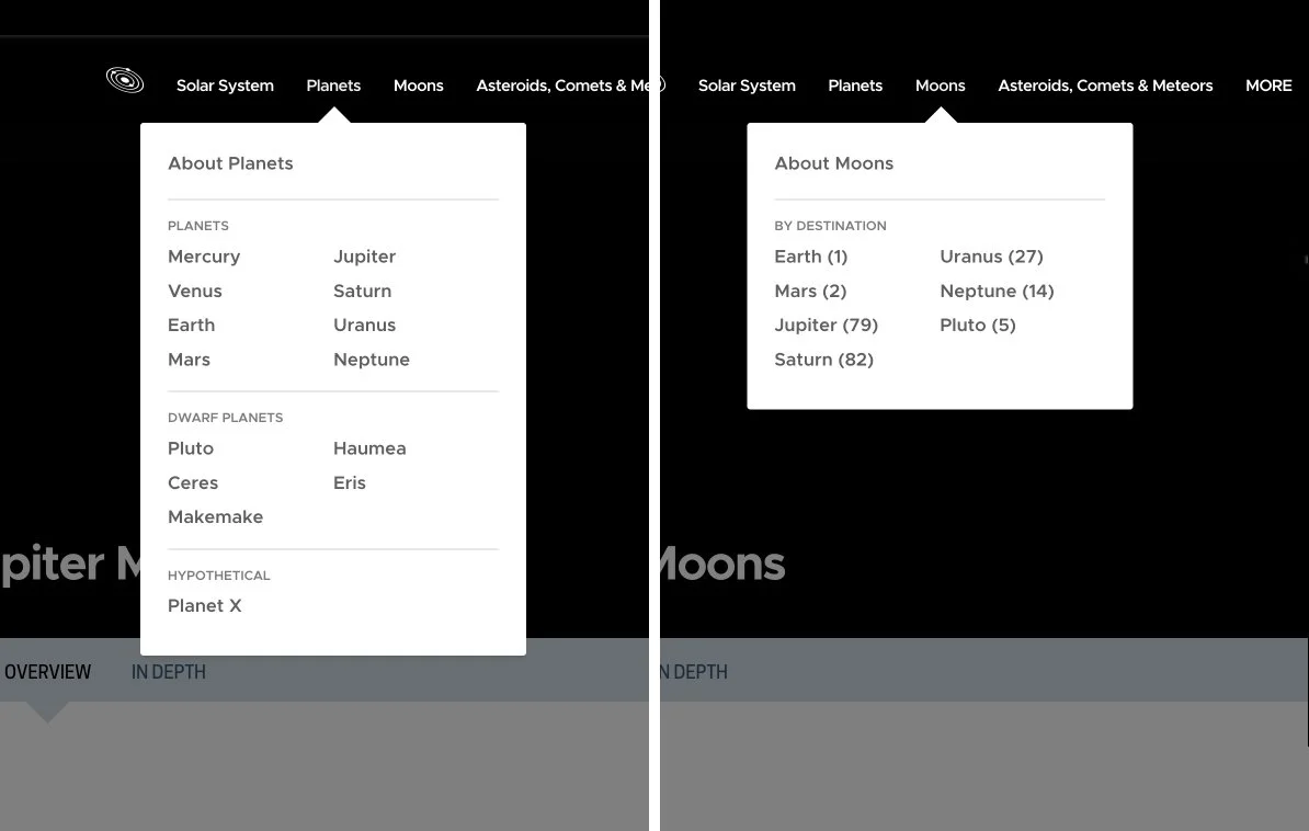
The global nav told a story about planets (classification) and their moons (how many, which ones have ‘em).
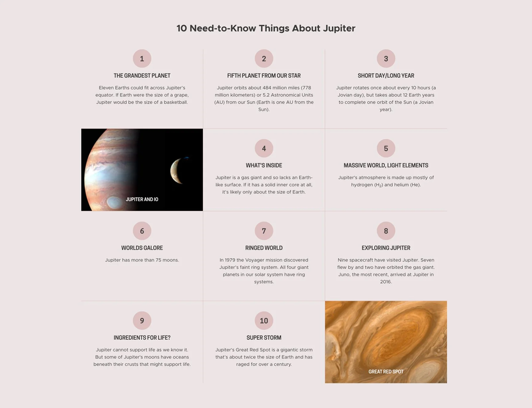
Major destinations featured a color themed “10 Things” module with easy-to-skim quick facts and fantastic imagery.
Collaboration
I partnered closely with:
NASA scientists and subject-matter experts
Educators and outreach teams
Developers implementing WebGL and modular templates
NASA digital leadership aligning long-term content strategy
Impact
Traffic nearly tripled
Engagement held steady for five years
Educators praised clarity
Multiple Webby Awards
Users explored deeper and longer
“It was gratifying to see our users more easily find the content they clearly were searching for — and discover the hidden gems of the great content that might have been overlooked in the dark recesses of the older versions of the site.”
Phillips Davis, Senior Web Publisher
Jet Propulsion Laboratory/NASA
Links
While the original site is no longer live, its architecture and interaction patterns informed the structure of NASA’s unified science.nasa.gov platform.